Saturday, August 29, 2026

AI in Academia - An experiment with an annual report

AI in Academia — An experiment with an annual report


The kind of image a Google Image search produces for “AI Professor”


A confession first: I have not used AI* in any serious capacity so far. There have been many an instance where there was an opportunity to play around and I have done so. Mostly chatGPT or similar or demonstrations of how well Gemini could summarize documents. I have not really used it for coding. I like my code simple since otherwise I cannot follow myself.

*really large language models, something separate from machine learning, which I have used professionally and teach about.

But the noise around AI has grown to a crescendo. To the point that our University has given us access to a Google account with Gemini specifically for AI usage. So I decided to a more controlled experiment. Not something that is open-ended and just generates the frizz of possibilities but something that would a) save me time, and b) save a headache that I have to go through annually and c)there is a decent experiment for me to set up.

The other trend in Academia, at least in the USA, is to ask for more and more status reporting and accountability. Professors are evaluated on an annual and often now on a longer period timescale as well. You get to justify your existence and employment over and over. This requires documentation and summary documents of that documentation.

Perfect! This is a task that I would like to avoid and involves meticulous summary of many many documents that I would love to pawn off to a machine. I read somewhere that AI generated text is for documents you don’t expect to be read really by people. Or by real people. I forget.

So I took my 2024 documentation pile and fed it into Gemini. And this is an experiment so I can check how well it did compared to the actual summary document I wrote with much sweat & swearing in 2025.

I fed it a CV, the various documents attesting I had reviewed a paper or similar, student evaluations, a prize certificate for advising, and the emails I had chucked into the “merit review 2024” as perhaps somewhat pertaining to what I was up to.

There are three categories in a typical evaluation: teaching, research (papers & grants), and service.

The Gemini generated document — after some fiddling with the prompt — generated a very convincing looking summary document for the first two. There was enough in the whole ensemble to make something that looked like what I had written up. Just with fewer spelling mistakes. The style was…very linked-in-y if you catch my drift. Call it Calvinism, call it Northern European upbringing (oh wait those are the same), call it my personality but it contained more explicit rah-rah than I would have done myself.

However, the mentoring of students and much of the service I had done was missing. So if you are using any “AI” to generate documents like that, please understand that this is where it will be underselling you to the administration. It looks like you could take on some more service work!

The reason is simple, it was not in the data. Student evaluations are easy to digest but supervising a student and their good experience with you is much much harder to capture in the documents like the ones I fed it. And putting thattogether is typically one of the more laborious parts of the annual reporting document. So unless you want to add a heap of personal data (here is access to my email accounts and photo library?), it will not show you the kind of work that makes the big impact on students, the reason they come to you for projects or take your classes. It doesn’t show your work on a public event or a committee.

Would it save me time? Maybe some. It would certainly get me started on this task-I-prefer-to-avoid. But there is a real risk that it may undersell what you’re trying to show. And if a potential cost-of-living-expenses “merit” raise is on the line, it might not be worth it. An actual human may read this.


Wednesday, February 11, 2026

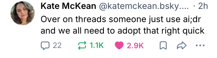
AI:DR


I saw this on the social media and it’s an excellent summary of how I feel about AI generated text. I went to several of our teaching and learning sessions and there was an honest effort to engage with the AI generation features offered now through the Microsoft suite and Blackboard. This is a new tool, there is lots of hype around it, let’s see what we can do.

And I was there to give it a merry go.

Maybe it speeds things up. A lot of setting up of course material etc feels like stuff i would happily hand over to a machine (“figure out when the spring break is and set deadlines on Friday accordingly.”)

The education team that was giving us the workshop “ai as a TA” (hmmm do these folks know what AITA stands for already?) gamely tried to show us what they were using and how. And maybe it could sorta work? You have a built in chatbot TA teaching Socratically (asking follow-up questions). Ehm? Yeah the chat adventure games from the 1980s could mostly do that (“AITA has been eaten by a Gru”).

What isn’t addressed is how stuff like this would be received. The galaxy zoo team could have probably done some foreshadowing. There it’s very difficult to have people engage with simulated I.e. “fake” galaxy images. People hate it. Discover new and interesting real stuff? Everyone is enthusiastic. Fake? Off they go.

So I would have to expend quite a bit of effort to a) check the ai isn’t hallucinating and b) that the students suspect nothing.

Yeah that’s too much stress for me. Pass.

And I don’t blame the students. I would just reply AI:DR to anything I suspected what generated this way. If you can’t be bothered to write it, I can’t be bothered to read it. And what kind of standing does an instructor have if they outsource their teaching of a topic — that they are supposedly an expert in — to a machine, a slop machine to boot!

But I hope this abbreviation catches on. Imagine emailing that back to some long winded email…

Monday, November 17, 2025

How I use Sunsama

When the university decided to move everything over to Outlook. This broke a lot of my workflow and I had to keep track of multiple calendars that unfortunately don’t know how to share. Then, I heard about Sunsama on the ADHD YouTube channel (how to ADHD). 


A funny but also true ADHDino comic that captures my struggle with todo lists.


Email is also an absolutely terrible way to keep track of what I need to do. I have many different hats to wear in my job as professor. And frankly inbox 0 doesn’t quite cut it. 


Enter Sunsama. I can see both calendars and what is on them. I have a backlog of items I need to do, I can add to this list from any of my devices. Whenever I have a “oh I need to do this” moment, I can add. 


Every day I start with the things planned for the day in the various calendars, add items from the backlog and see if I can get through as much as I can. 


I don’t pull individual emails into the Sunsama anymore. I have a 30min Burn Time scheduled where I get through as much admin crap as possible. Much less task switching as I go from teaching to grant application to science and scheduling and back. 


And my todo list lives in Sunsama. Nowhere else. It has freed up so much executive function it’s unreal. I’m not super burned out after this semester and it was a doozy. Complete superpower. Love it. 


This has lowered my reactiveness and stress levels (for work, a lot of other stuff stresses me out still). 


It’s not panacea but it works fantastic as part of a larger system. Where I get my time and focus back to do things I want to do. I have enough focus to carefully say no to things. So if I say yes. It’s backed with mental bandwidth.  

Saturday, August 23, 2025

Improved Inbox 0

I’ve been inbox 0 since a colleague showed me almost a decade ago. There has been some pushback but it does help having everything in categories for working on next. The goal of inbox 0 helps me get over the initial resistance of doing some of this stuff. And it’s the stuff I should not let linger. 

Oh Outlook. How wrong you are. It's all in task folders.


The trouble is that all the admin, much of it of dubious utility, does need to happen or email is flooded with “follow-up”. Basically university admin is why the book “a world without email” by Cal Newport was written. And inbox 0 may shift your activity to a day filled with vaportasks. Often marked as “high priority” too just so your flight or fight response is triggered something extra. Microsoft Teams/Outlook is especially prone to this sort of messages in its basic design with messages about messages etc. 


I was  listening to Cal Newport’s podcast and he advises to batch such tasks for a couple of slots in the week, rather than jumping from context to context. And this resonated because the inbox is a mix of tasks, even if it’s the tasks for today or this week, I still do a lot of task switching. It sounds trivial but it’s the kind of jumping around my brain does on its own already and it exhausts me. So if I am forced to jump around, it wears me out faster, and then I struggle more to stay on a single task. 


So when Cal Newport talked about different categories he uses, I considered a way to help me beat the incessant drum that is university email.  So I have made a new set of categories to put tasks while doing inbox 0:


Admin

Grad Student

Papers to read

Scheduling

Teaching

Undergraduate research


And then there is still “today”, “this week” “this month” and “someday” (let’s be honest that means “never”). 


I have scheduled at 1pm “admin” and set a timer for 30min. Burn through as much as I can in that time and importantly not feel guilty about moving on to, you know, actual work. 


I am testing this new system now and it is clearing up the mental load that is admin for sure. The real test will be when the fall semester starts in earnest. 


Thursday, June 19, 2025

Neighbor vs Tree

 No this is not a story from a neighborhood chatgroup. I had a machine Learning question specifically for my science interests. In 2024, I classified galaxies a JWST field using k-nearest neighbor (see the paper here). This is a very simple algorithm where you use a space with a training sample spread throughout and every time you get a new data-point, you classify it as the (weighted) average of the k-nearest neighbors to that new point. The only variables is the number of neighbors (k) and whether or not you want to weigh them with distance. It works well since it will have high resolution where you have a lot of information in the training set and will have to average out in sparser areas. 

It worked pretty well. I thought it did the trick in JWST. However, I also want to do this in HST parallel fields and there the color-information is as rich as it is in JWST fields. We get four filters and that is it. Back in 2014 I generated an M-dwarf catalog and in 2016 two students from Leiden modeled the Milky Way from this catalog (2014 paper and 2016 paper). I now want to do this for many more fields available in the Hubble archive. 

Enter Yggdrasil, the mother tree (of decisions?)

I read about it on Medium here. This seems to be an upgrade to the standard decision tree algorithm; gradient boosted trees. Here the only variable is how many branches you allow for a decision tree. 

So I tried it “out of the box” on the same training set to see if we can do better. Here is where we start with kNN classifying. I have a set of colors for objects and I want to know if these are M, L- or T-type dwarfs and what their subtype is. This is a multiclassing problem. A lot of ML algorithms cannot handle that. But kNN and Yggdrasil GBT can. 

The confusion matrix using kNN with k=4 on the JWST and HST colors. We are aiming for getting this right to within a subtype (0.1 type resolution).

kNN is definitely not doing bad! But there is a persistent few misclassifications. How does Yggdrasil do? 

The same as above but now classified by Yggdrasil Gradient Boosted Trees. 

The difference is not great and this is reflected in the respective precision, recall, F1-score and accuracy. 

But call it a hunch, I suspected Yggdrasil could perform a little better than kNN. Or at least I wanted to see if it could. This was with all the information we have on deep fields from both JWST and Hubble. 

How well can we separate out by subtype (Delta T)? Here are the metrics by the resolution we are attempting for kNN and Yggdrasil. Very comparable. 


The precision, recall, F1-score and accuracy of kNN(k=4) and Yggdrasil on JWST and HST colors combined.

The only thing that really stood out was that Yggdrasil starts out a little better at Delta T = 0.2 and 0.3. I used 0.4 in 2024 for kNN since it was at 80% for all the metrics. Looks like Yggdrasil can do better type resolution! 

This is the color-space if we only have Hubble:

The near-infrared colors of stars in Hubble observations. You can see that the different types (M0=0.0, L0=1.0 and T0= 2.0) are separated some but not fully.

So let’s try this with just this Hubble set of filters:

The precision, recall, F1-score and accuracy of kNN(k=4) and Yggdrasil on HST-only colors.

The Yggdrasil performs remarkably like it did with JWST+HST (I got a little suspicious there for a second)

So if you’re ok with metrics at ~70%, Yggdrasil can get to within 2 subtypes with just the four Hubble filters. or 4 subtypes it performs as well as the kNN at ~80%. 

Reflecting on this, there is a difference between better (which you feel like is always just around the corner) and good enough. That 10% improvement over kNN at Delta T=0.2 means I can slice the population pretty finely into different brown dwarf types and the 70% accuracy means I have enough of them identified to model the Milky Way distribution? That will be next. 


Friday, May 9, 2025

Dust in Galaxies over Cosmic Times

This week’s blog post had to be about Trevor Butrum’s paper coming out on astro-ph!

A comparison of dust content and properties in GAMA/G10-COSMOS/3D-HST and SIMBA cosmological simulations

Trevor Butrum (University of Louisville), Benne Holwerda (University of Louisville), Romeel Dave (University of Edinburgh), Kyle Cook (University of Louisville), Clayton Robertson (University of Louisville), Jochen Liske(University of Hamburg)

https://arxiv.org/abs/2505.02359

This all started with an off-the wall idea I had following the work by Driver+ 2018. There the emphasis was on the volume densities of some of the main components of galaxies we can infer from their light; their stellar mass, their current star-formation and their dust content.

The neat trick for that paper was to sum the luminosity functions and get a volume density. This was a neat approach as it used a heterodyne mix of surveys, GAMA, G10/COSMOS and the 3D-HST survey for ever increasing distances. This creates some gaps in the coverage as you can see very nicely in Trevor’s first plot:

The complete data sets of GAMA, G10-COSMOS, 3D-HST with stellar mass

But the mass range 7 to 11 is reasonably covered. The idea I had was to compare the dust masses inferred for galaxies by the SED fits from Driver+ 2018 with those predicted in The Simba simulations. These are good volume and reasonable physics SAMs that seem to be doing a good job on the dust household (including ejection).


The dust mass ranges selected for this study. We plot GAMA/G10-COSMOS/3D-HST data as black dots. We plot the selected data with the ranges applied in green dots with a box surrounding them. The red dotted line represents the dust mass volume limits of the surveys. Note that we exclude GAMA data at z=0.5 due to volume-related issues in the selections. Selection effects were a real challenge. 


So we picked four slices in the Driver+ data and compared them to The Simba catalog at the same redshift/epoch. Simple no?

Normalized counts of stellar mass from Simba and GAMA/G10-COSMOS/3D-HST. The observational dataset is separated into individual surveys to highlight the distinctions between them. Trevor figured out how to make these mass functions completely on his own! 

And that is what Trevor did! And it worked. Reasonably well. It is of course quite instructive as well to see where itdidn’t work as well. And that occupied quite a bit of Trevor’s time.

And there is some work for the next generations of galaxy evolutionary models. Simba misses dust-rich galaxies for all epochs above z=0 and Simba does not accurately model low-dust mass galaxies at earlier epochs.


Saturday, May 3, 2025

The planetarium as a teaching space

 I love the Rauch Planetarium at the University of Louisvlle as the place to teach Astronomy in. That probably doesn’t sound controversial to you when an astronomer says so but apparently it is?

A space dedicated to showing the night sky and our Universe gets students already in an astronomy frame of mind. But it goes beyond that. So much beyond that.

Not only can we show how the night sky looks without the city lights or the ever multiplying artificial satellites thanks to Starlink and others mega-constellations. We can show how it looked to ice age hunter-gatherers or people in the Southern hemisphere. That links us all across the globe and along the age of the human race. It also allows me to link what you see in the night sky directly to physics. We have a program that shows the (now familiar) stars in the night sky which then move to their place on the color-luminosity diagram and the class learns the link between temperature and luminosity of stars around us. That kind of linking between sky and physics is what my class is all about. More planetarium resources like this are made available by federal projects like the Rubin Observatory and NASA.

Alternatively I can link stars and navigation like the student have seen in the Disney movie Moana. Or we can work on the different constellations across global cultures. Shared exploration like we do in the planetarium is what we aim for in higher education and the Planetarium supercharges that for my subject astronomy.

One of the NASA shows showing the ISS with its cosmic ray detectors. 

This shared experience is teaching them collectively, a superpower for learning. When we learn together, we do it better and faster. If we do all our learning on individual screens, it remains an isolating experience.

If you want to enjoy the planetarium, you cannot have your screen out. It makes a difference.

Unfortunately, my class is the first and often only time students at UofL see inside this amazing space. The Louisville schools have not had the opportunity to organize school trips to the Planetarium because it closed and stayed closed since March 2020. And that is a shame but also a missed opportunity for UofL. These school trips brought those middle- and high school students to campus who might consider UofL for their immediate future.

This is a traditional slide, similar to the ones I use in class. And then we switch to the dome projection of the same data. It makes a huge difference!

The obstacle is two things, staff and equipment, but really that’s both a money issue. Staff got reassigned within UofL but we are at risk of not having people who know how to run a planetarium anymore. And the equipment is now well over 20 years old. It’s starting to show its age (“why is half the sky brighter than the other?”) The shows aged a bit too. We have a show where Liam Neeson confidently states there is no direct picture of a black hole. My science hasn’t sat still since that show came out: it made a picture of a black hole, found the first galaxies and more than 5000 planets around nearby stars. Just to give you an idea. More up-to-date material would be great.

The planetarium does two things that are increasingly rare in the modern world: a good look at the night’s sky and space and a shared learning experience for students.

The author with the Sloan Digital Sky Survey exhibit in the hall of the Planetarium. I got the SDSS plate but the staff turned it into the amazing exhibit.